POINTER Cooling & Heating
Jeff Stewart, owner of Pointer Cooling & Heating, came to us with a brand that meant something personal but lacked the visual strength and emotional clarity to connect with his market. His original logo featured his son Riley and their loyal pointer dog, nicknamed “Reliable Riley.” While the concept was meaningful to Jeff and his family, the artwork looked more like a generic cartoon and didn’t express the depth of the relationship between Riley and the dog or how that bond reflected the company’s approach to service. It had heart, but it didn’t have focus. Our goal with this rebrand was to take that raw, personal story and shape it into a strong identity that would stand out in the Charleston market and instantly communicate trust, loyalty, and family values.
During our research, we took a close look at the HVAC landscape in Charleston and surrounding areas. What we found confirmed what Jeff had experienced firsthand. Many of the larger brands dominating the space were doing so with polished ads and big budgets, but when it came to customer service, they often fell short. Reviews across the board showed frustration, poor communication, and a sense that these companies were more interested in profits than people. That opened the door for a company like Pointer—family-owned, community-based, and driven by doing the right thing—to become a trusted leader in the area. But it needed the right look and messaging to make that clear from the start.
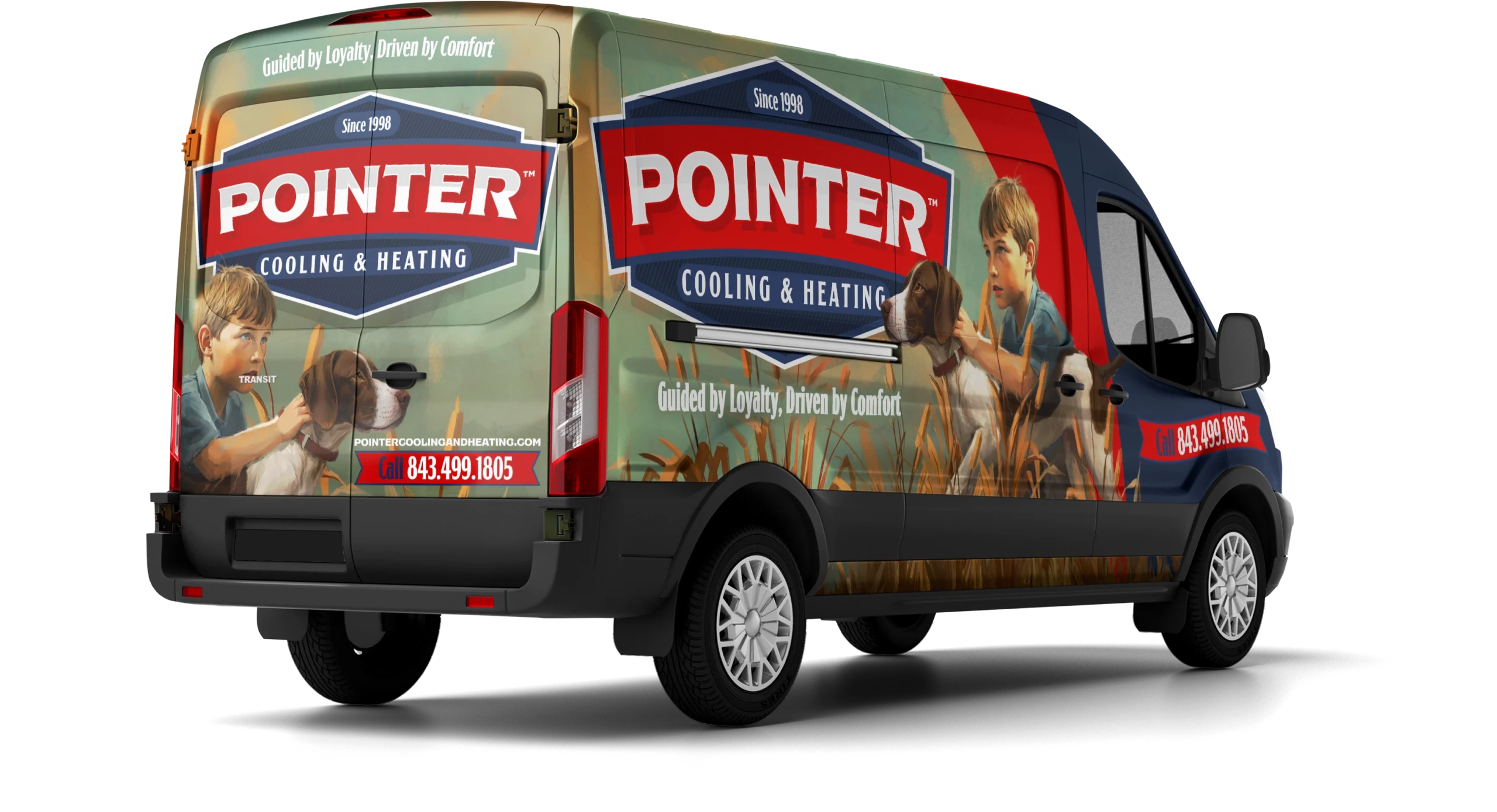
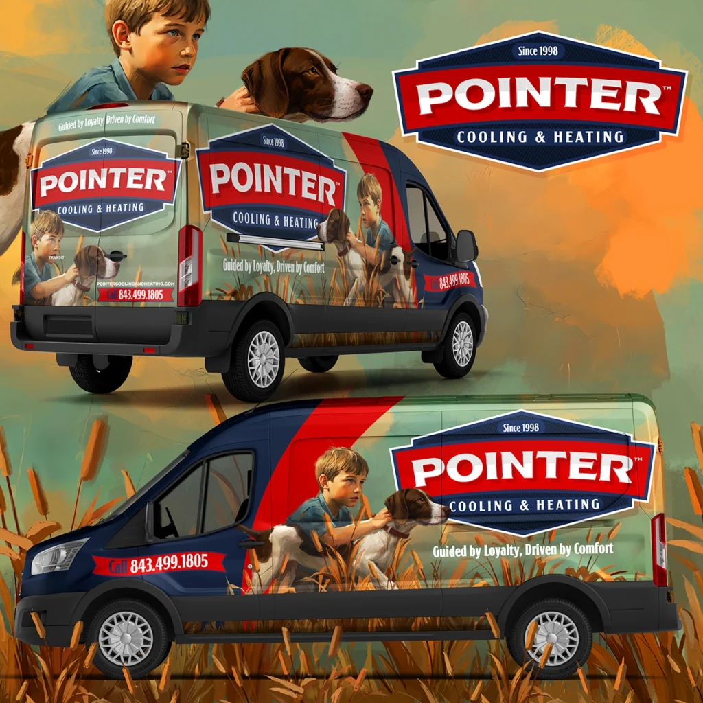
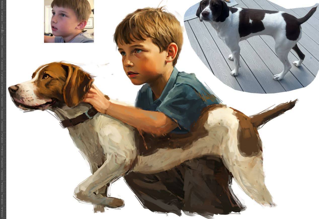
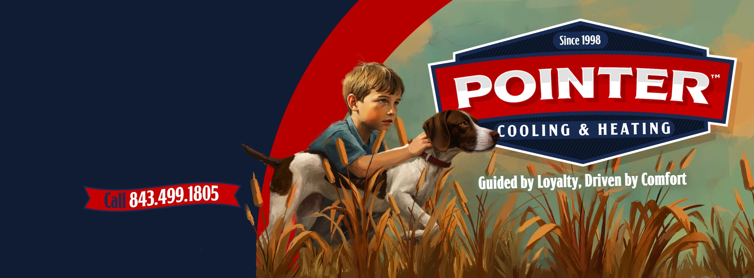
We dug into the heart of the “Reliable Riley” story and reimagined it not just as a character, but as a symbol. In our updated design, Riley is shown gently holding the family dog, who is pointing ahead with intention. This moment reflects both emotional connection and forward movement. It visually communicates what the brand is all about—guidance, loyalty, and comfort. From that, we developed the slogan “Guided by Loyalty, Driven by Comfort.” This tagline ties the personal story to the company’s mission and instantly separates Pointer from companies that treat customers like numbers.
To support this message, we created a visual identity inspired by classic Americana, with a style reminiscent of Norman Rockwell’s timeless illustrations. Deep reds, whites, and blues were chosen to evoke a sense of tradition, honesty, and pride. The shapes and layout feel clean, familiar, and rooted in family-first values. This isn’t just branding that looks good. It’s branding that tells a story and builds immediate trust. With this rebrand, Pointer Cooling & Heating now shows up in the market the same way it operates—reliable, loyal, and ready to guide its customers to comfort, every time.
Out With Old, In with the New
Out with the old, in with the new. That was the mission when we took on the task of transforming Pointer Cooling & Heating’s outdated logo into something truly iconic. The original design lacked refinement and failed to capture the deeper story behind the brand. We reimagined it with purpose, creating a clean, timeless visual that highlights the bond between Riley and his loyal pointer. The result is a brand mark that feels personal, memorable, and built to last—something customers will recognize and trust at a glance.
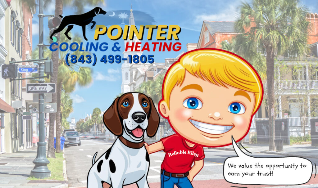
This visual wouldn’t work well as the face of a home service brand for several key reasons. First, the logo itself is overly simplistic. The text appears to be typed out without any intentional design or professional lockup. It lacks cohesion, hierarchy, and brand character, which are important elements that make a wordmark memorable and trustworthy. The use of basic fonts and disconnected colors gives the impression that the logo was thrown together quickly rather than thoughtfully crafted. The mascot illustration also falls short. It resembles AI-generated or low-cost clip art, with exaggerated features that come across as cartoonish rather than personable. This can create a disconnect for customers looking for reliable, high-quality service.
When people are inviting a company into their home to handle something as important as heating and cooling, trust and professionalism are everything. A cheaply made or generic design undermines that trust. Customers tend to associate high-quality branding with high-quality service. If the brand doesn’t look like it takes itself seriously, it becomes harder for potential clients to believe the company will take their needs seriously either. Beyond the look, this design doesn’t communicate any deeper message or emotional connection. There’s no indication of the family values, loyalty, or care that define Pointer Cooling & Heating as a company. Strong brands tell a story and evoke a feeling. This one, unfortunately, does neither. It misses the mark on both clarity and connection, and in a competitive market, that can be the difference between being noticed or being ignored.
The Process
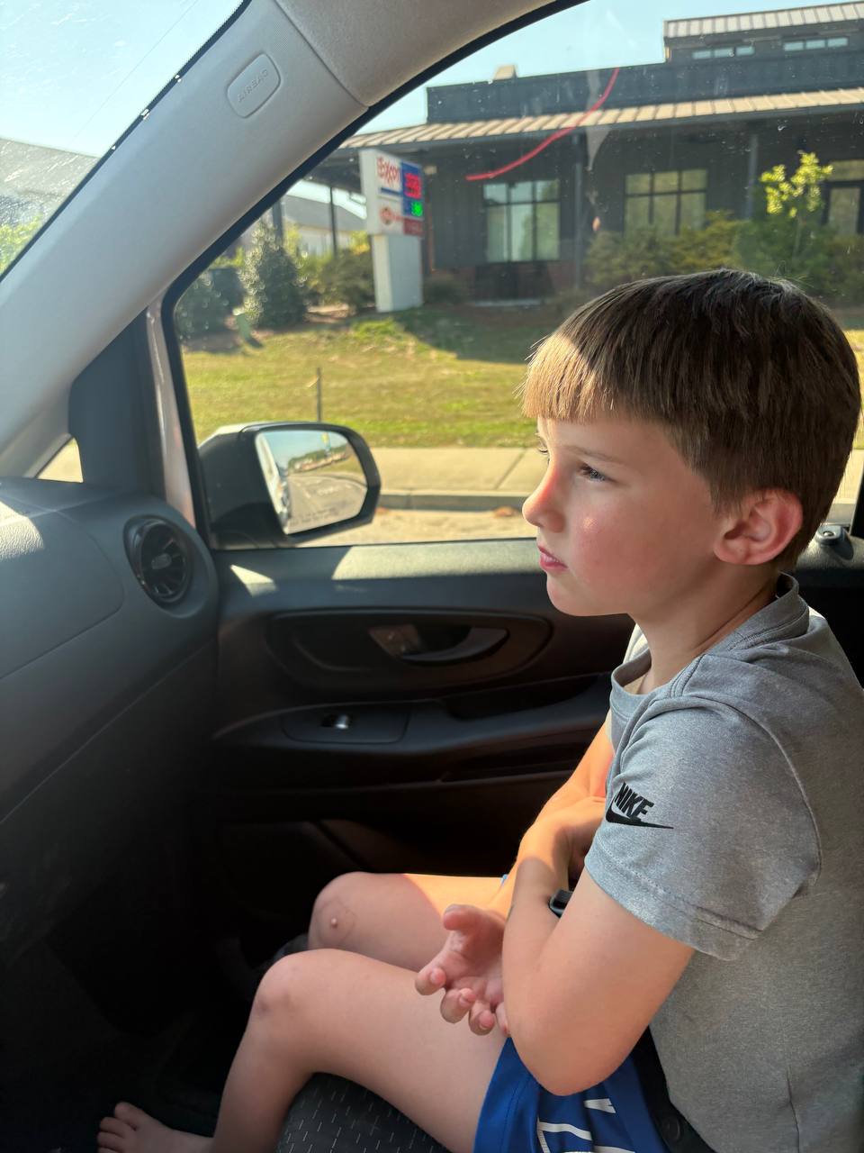
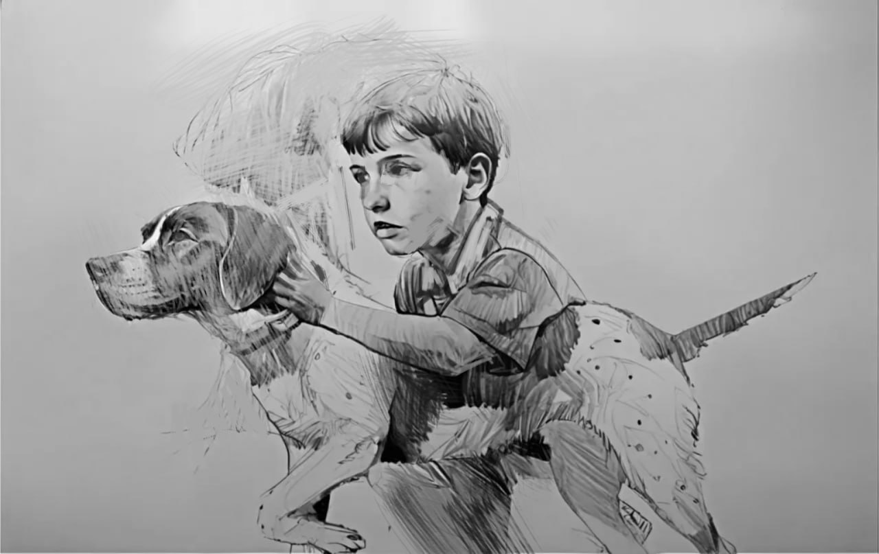
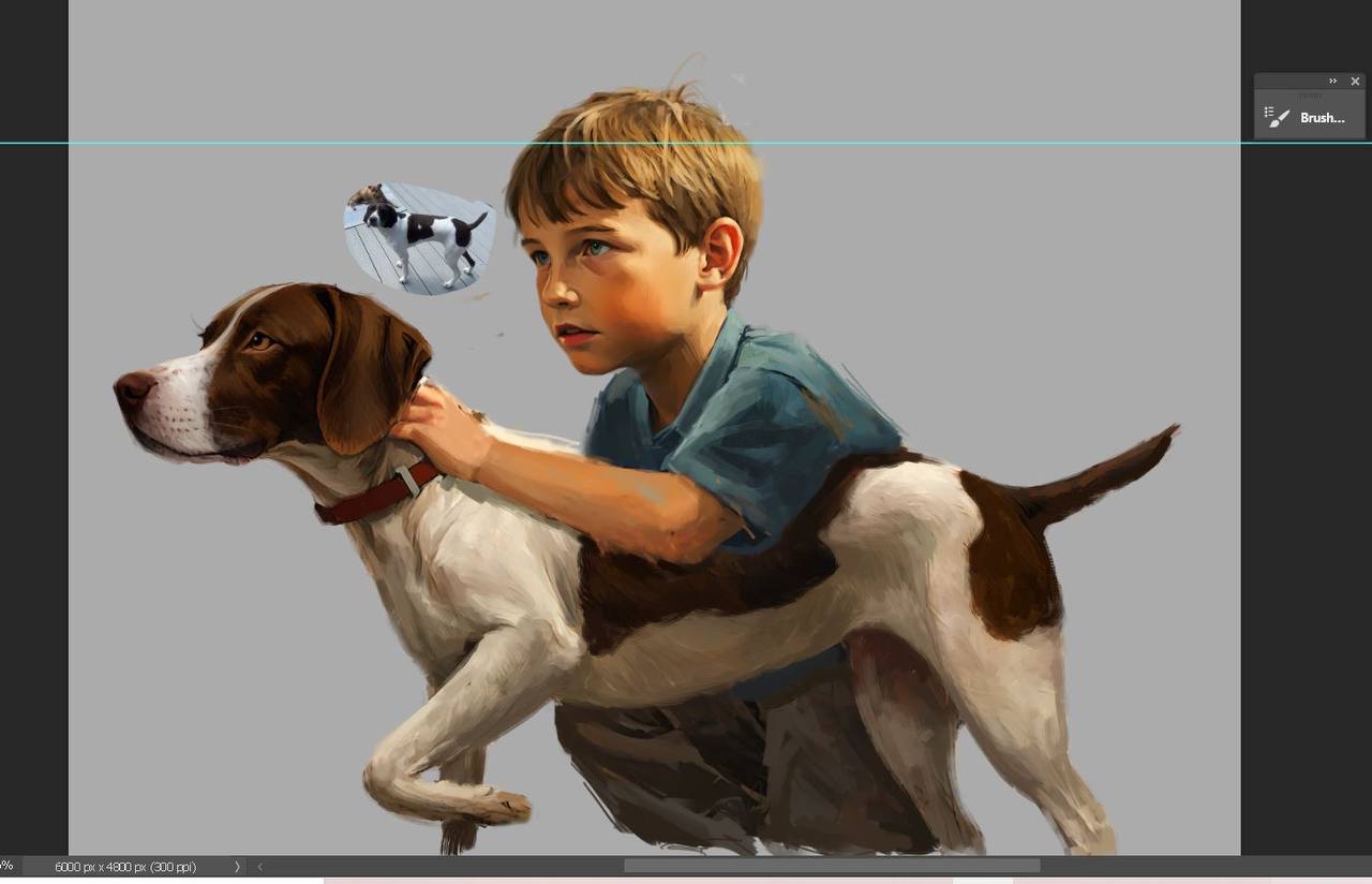
We began by taking the client’s personal photos of his son and their pointer dog and turning them into a detailed pencil sketch that focused on their natural interaction and bond. Rather than exaggerating features or relying on generic styles, we worked to capture a moment that felt authentic and warm. That sketch became the foundation for a hand-painted illustration that brought depth, emotion, and purpose to the image. Every brushstroke was intentional, reflecting the trust, loyalty, and family connection at the heart of Pointer Cooling & Heating. The final artwork doesn’t just represent the brand—it tells its story.
Once the sketch was approved, we transitioned into a full-color painting designed to embody the brand’s message. Each stroke was guided by the values the company stands for: loyalty, trust, comfort, and family. We used a warm, vintage-inspired palette to give the illustration a timeless, Americana feel that tied back into the overall aesthetic of the brand. The finished piece didn’t just serve as a logo or graphic—it became the emotional centerpiece of the identity. It tells a story at a glance, inviting customers to feel the same sense of care and guidance that Jeff and his family bring to every home they serve.

Closing Thoughts
This branding project for Pointer Cooling & Heating was more than a visual upgrade. It was about bringing a deeply personal story to life in a way that resonates with the people they serve. From the start, we knew this wasn’t just about creating a better logo. It was about capturing the heart of a family-owned business built on loyalty, trust, and genuine care. By translating the bond between Riley and his dog into a meaningful visual identity, we gave the company a symbol that speaks volumes without saying a word.
The result is a brand that feels authentic, timeless, and memorable. It sets Pointer apart in a crowded market and reflects the values that drive the business every day. This is the kind of brand that does more than look good. It builds connection, earns trust, and grows with the company. We are proud to have helped shape a visual identity that feels as strong and dependable as the service Pointer Cooling & Heating delivers.